Silvertips Unveil New Logo, 10th Anniversary Jerseys
The Everett Silvertips introduced a new logo and redesigned uniforms that will be used during the club’s 10th Anniversary season during our Alumni Dinner Friday night at the Comcast Arena Edward D. Hansen Conference Center. The event offered fans and former players the initial glimpse at the first significant re-imagining of the team’s look since its inception in the WHL in 2003. Current Silvertips players Manraj Hayer and Austin Adam were on hand to show off the new jerseys for the crowd.
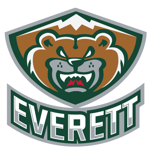
 The new primary logo features a frontal view of the same Silvertip bear that has been the centerpiece of the team’s branding since its beginnings. The bear is set inside a background in the shape of a shield, which also incorporates the same mountains that have been used on the trim of Everett’s uniforms in previous years. Although it does not appear on the uniforms, the Silvertips have also introduced a new, more aggressive version of our secondary logo consisting of a swiping bear claw that forms the letter “E”. The concepts were designed by Keith Flynn of Flynnagain Productions.
While using the same color scheme that has always been associated with the ‘Tips, the new jerseys feature a pattern that is wholly different from anything the team has used before. Everett’s white-based home uniforms and forest green road threads will now include silver and white piping along the sleeves and body of the jerseys, which also incorporate segments of black for the first time. Patches on both shoulders include the team’s traditional bear logo in front of a Roman-numeral ten, while both the home and away versions are trimmed across the bottom with the words “Everett” on the front and “Silvertips” on the back.
“We wanted to use this opportunity of our 10th Anniversary season to put together a classic-looking logo and uniform that represents the Silvertips and our fans,” said Executive Vice President/Assistant General Manager Zoran Rajcic. “We’ve always been praised for our uniforms, and it was important to the organization during this two-year process to create a new dimension to our brand while staying true to our original look.”
“This jersey design will be used only for our 10th anniversary 2012-13 WHL season. After this year we will return to a layout similar to what we’ve used in the past while incorporating both the new and original versions of our logos. We’re excited to show off this new look for the best fans in the WHL, and I know it will catch on quickly with our supporters.”
The new jerseys are not yet in stock at the Silvertips Team Store, but pre-orders are being accepted now for delivery in September. For more information on how to order yours, call 425-252-5100 or stop by the Team Store at the northwest corner of Comcast Arena (at the intersection of Hewitt and Oakes) anytime between 10:00 am and 4:00 pm, Monday through Friday.
In conjunction with the unveiling of our new logo and uniforms, the Silvertips will also launch an updated version of www.everettsilvertips.com on Monday. The Silvertips’ official website will feature the new logos in a revised appearance while still offering the same content and functionality fans have come to appreciate.
To keep up with all the latest ‘Tips news and join in the conversation about our new look, “like” the Everett Silvertips Hockey Club on Facebook or follow @WHLSilvertips on Twitter.
