Remembering Silvertips logo designer Keith Flynn
By Hailey Robinson – Silvertips Staff Writer
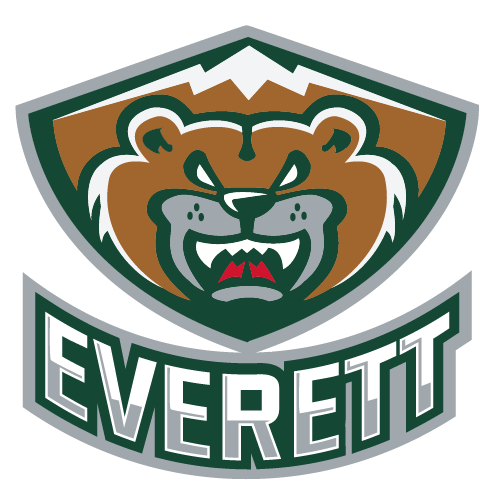
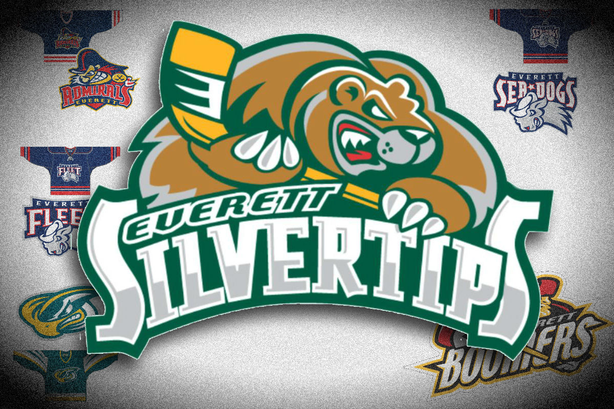
Keith Flynn of Flynnagain productions was the designer of dozens of logos for sports teams, leagues, and special events, but most recognizably to Silvertips fans two logos that appear on Tips jerseys: the iconic logo of Lincoln holding a stick and the logo of the Western Hockey League.
Flynn designed logos for teams all over the CHL, but the Tips logo was one of his earlier designs, created for the team’s inaugural season in 2003. In honor of his life and work, we’re looking back not just on the logo that graces the front of Silvertips jerseys, but also logos Flynn designed that didn’t make the cut.
When the WHL expanded to Everett in 2002, the ownership group had several ideas in mind for a name and logo
“When we were looking at the team we hadn’t been decisive in what we were going to do,” Chief operating officer Zoran Rajcic, who has been with the team since the beginning, said. “When it was all said and done we probably had about 15 different logos. The original other potential logos that we were looking at that we had him design, and we ended up with the Silvertips logo.”
The focus for the then-unnamed team was community. The people of Everett — the team’s future fans — had to be included in the process of naming the team.
“So when it was all said and done it was a pretty difficult decision, and we had included the fans to give us an idea of where they wanted this to go,” Rajcic said. “We wanted to make sure the community felt included in what we were doing.”
Many of the names had local connections. Some were military and navy related, a nod to the nearby naval station.


However, the team was looking for a more unique logo and color scheme. Blue and red is a classic hockey color scheme, and was already worn by a number of teams in the WHL.
When it came to the bear mascot and the name Silvertips, the recognizable logo existed in more than one form. The green, white, and silver of the current logo wasn’t the only color combination the Tips considered.
Finally, though, the Tips ended up with the now classic logo of a bear holding a hockey stick. While the design of their jerseys have changed, the logo has remained the same for the team’s 16 years in Everett.
“It was a pretty neat process because I’d never gone through an expansion I’d only worked for teams that were already in existence,” Rajcic said. “From my perspective going through that process was kind of cool, when you get the opportunity to do the franchise. For him, that’s all he does, rebrand teams logos and start from scratch. It was pretty amazing to see the work that he had done for us.”
