From the Stands: Storm update primary logo
By Paul Osborne, Guelph Mercury Tribune
A brand refresh is always a big decision. It doesn’t matter if you’re an established private business, a public institution or a local hockey club, your brand is what represents you before millions of people.
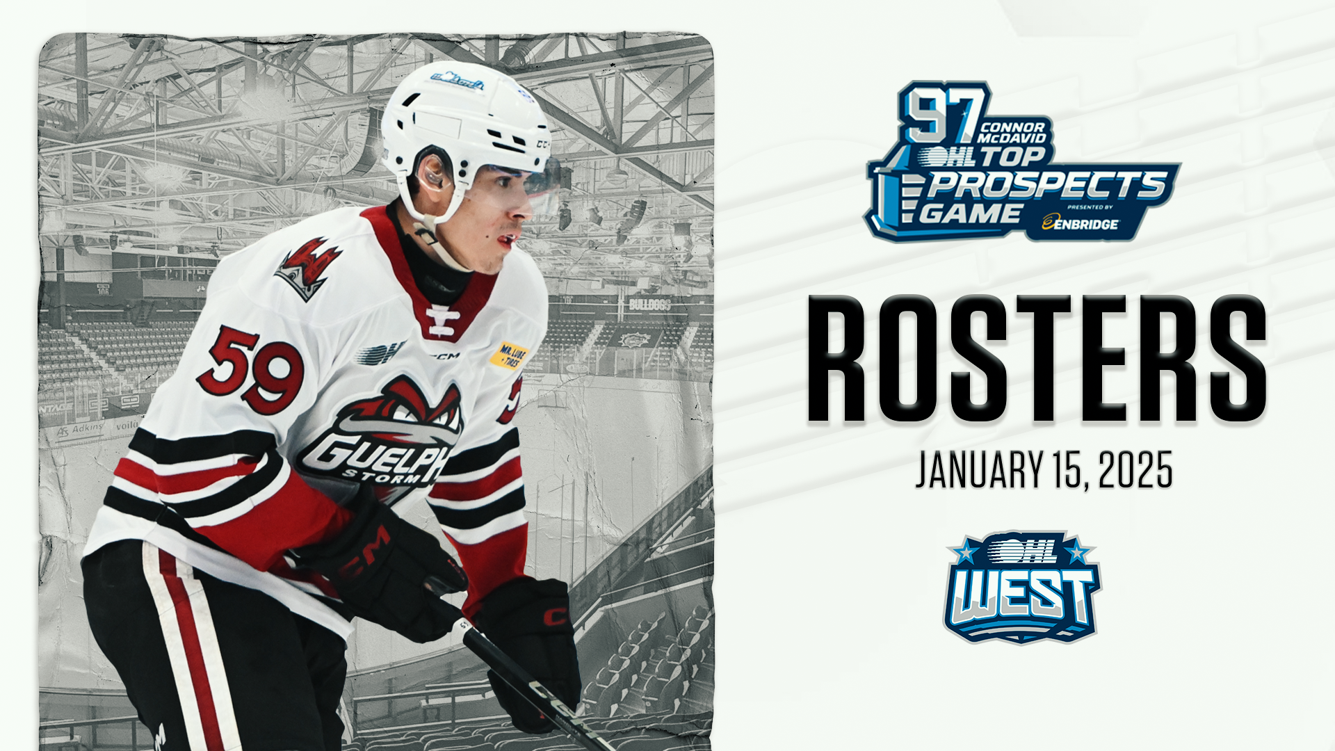
The Guelph Storm recently updated their logo, still using similar colours and the Storm cloud character from the past, but adding a more modern font and forcing opponents to stare down the character.
“Storms are all about power and strength,” said the Storm’s Vice-President, Business Operations Matt Newby. “What we did was make the character more menacing. The old logo he is moving to the side but by turning his eyes straight ahead, the storm is coming right at you now.”
The new logo was actually pretty much finalized by the end of June of 2017.
“A year ago March we had to advise CCM (who makes the OHL jerseys) that we were contemplating a change,” said Newby. “We had narrowed down the look by then and they sent back some cresting examples so we could see how they would look on an actual jersey. By November of 2017 we had to sign off on the logo we wanted.”
The Storm worked with Flynnagain Productions out of Waterloo and originally they were encouraged to present something completely different from the old Storm logo.
“They presented several designs that incorporated Guelph landmarks like the church and the rivers in town but in the end we kept coming back to our original storm character,” said Newby. “And when they turned him and had him coming straight on, that resonated with the different people (of all age groups) we tested the logo with.”
The Storm used their original logo of a storm cloud on a red triangle with the word “Storm” on top from 1991 to 1997. The newer look came during the 1997-98 season and was in place for twenty years. Newby and the owners felt it was time for a refresh.
“When you looked at our logo on a t-shirt or hat it always seemed top heavy and the font was more 1990ish,” said Newby. “The dusty trail that followed the main logo also caused sizing problems in certain situations. It isn’t symmetrical so at centre ice for instance we had to go with a smaller version to allow for the dust trail. Our new logo at centre ice will be much more prominent.”
Some might feel that the new logo was to help drive merchandize sales but Newby says that clothing/jersey sales are not a huge part of the team’s financial picture and adds with the colouring of the jersey’s remaining the same, fans with the older logo won’t look out of place at all.
The club decided to announce the change in June because of all the work that now needs to be done to replace the old with the new.
“By the time we replace the carpet in the dressing room and paint on the walls, and change the logos throughout the arena and prepare all of our print and advertising material for the season and let other teams know so they could use up-to-date logos on things like their season tickets, it had to happen sooner than later.”
From the Stands … Isaac Ratcliffe was the lone Storm player invited to the World Junior summer camp meaning he is on the radar to make the team…Former captain Garrett McFadden took part in the Vancouver Canucks prospects camp as a free agent.
